


- June 4, 2026
- 0 Comments
Colour psychology in marketing refers to how different colours influence customer emotions, perceptions, and buying decisions. Brands use colours strategically to create trust, excitement, urgency, or luxury depending on the audience they want to attract. Studies suggest that up to 90% of snap judgments about products are influenced by colour alone.
Think about some of the world’s biggest brands. Coca-Cola uses red to create excitement and energy, while Facebook uses blue to build trust and reliability. These choices are never random. Every colour sends a message to consumers before they even read a single word about the brand.
This guide explains the psychology of colour in marketing and branding, what different colours mean, how they affect consumer behaviour, and how businesses can choose brand colours strategically.
What Is the Psychology of Colour in Marketing?
Colour psychology in marketing is the study of how colours influence emotions, behaviours, and purchasing decisions. Businesses use specific colours in logos, websites, advertisements, packaging, and social media designs to shape how consumers feel about a brand.
Different colours create different emotional reactions. Red often creates urgency and excitement, while blue is associated with trust and stability. This is one reason many finances, healthcare, and technology companies prefer blue branding.
Colour also improves brand recognition. When customers repeatedly see the same colours connected to a business, they begin recognizing and remembering the brand more easily.
Here’s why brand Colour psychology matters:
- Colours influence first impressions
- Colours help communicate brand personality
- Consistent colours improve brand recognition
- Certain shades can increase clicks and engagement
A conversion simply means getting users to take action, such as clicking a button, making a purchase, or filling out a form.
How Does Colour Affect Consumer Behaviour?
Colours subconsciously influence how consumers perceive brands and whether they trust, remember, or buy from them. Before customers read about a product, they usually react to visual branding first.
This matters even more in digital marketing, where people make decisions quickly. Website visitors often form an impression within seconds, and colours play a major role in shaping that reaction.
Here’s how Colours affect consumer behaviour:
- Blue creates trust: Banks, healthcare companies, and SaaS brands use blue because it feels reliable and professional.
- Red creates urgency: Fast-food chains and sale banners use red to encourage quick decisions.
- Green signals wellness: Organic and eco-friendly brands use green to represent health and balance.
- Black suggests luxury: Premium brands use black to create sophistication and exclusivity.
Colour psychology also affects website design and conversions. Many businesses test different CTA button Colours, landing pages, and advertisements to improve engagement.A CTA, or call-to-action, is simply a button or message encouraging users to take the next step, such as “Buy Now” or “Get Started.”
What Does Each Colour Mean in Branding?
Each Colour carries psychological associations that brands use to shape customer perception and communicate their values.
| Colour | Meaning & Emotions | Brand Examples |
|---|---|---|
| Red | Passion, urgency, excitement, energy | Coca-Cola, Netflix, Target |
| Blue | Trust, security, professionalism, calmness | Facebook, PayPal, Pfizer |
| Green | Health, growth, nature, balance | Starbucks, Whole Foods |
| Yellow | Happiness, warmth, optimism | IKEA, McDonald’s |
| Purple | Luxury, creativity, sophistication | Hallmark, Twitch |
| Orange | Enthusiasm, confidence, fun | Fanta, Nickelodeon |
| Black | Elegance, power, exclusivity | Chanel, Apple |
| White | Simplicity, cleanliness, minimalism | Tesla, Samsung |
| Brown | Reliability, warmth, ruggedness | UPS, Hershey’s |
Red in Marketing
Red is one of the strongest attention-grabbing colours in marketing. It creates urgency and excitement, which is why many fast-food brands and sale banners use it strategically.
Blue in Branding
Blue is widely considered the most trusted colour in marketing because it creates feelings of reliability and professionalism. Finance and technology brands often use blue to reduce perceived risk.
Green in Consumer Psychology
Green is strongly connected with health, freshness, and sustainability. Wellness and eco-friendly brands frequently use green because consumers naturally associate it with nature and balance.
Black in Luxury Branding
Luxury brands often combine black with minimalist designs because darker palettes create exclusivity and sophistication.
How to Choose the Right Brand Colours
Choosing the right brand colour requires understanding your audience, industry, and the emotions you want customers to associate with your business.
Here’s a simple framework business can follow:
1. Define Your Brand Personality
Decide how you want your brand to feel. Should it appear trustworthy, playful, luxurious, or energetic?
2. Study Your Industry
Different industries naturally lean toward certain colours. Healthcare brands often use blue and green, while luxury brands usually prefer black or neutral shades.
3. Understand Your Audience
Different audiences respond differently to colours. Younger audiences may prefer bold palettes, while premium audiences often prefer minimal and sophisticated branding.
4. Use a Balanced Palette
The 60-30-10 rule works well:
- 60% primary colour
- 30% secondary colour
- 10% accent colour
This creates visual balance without overwhelming users.
5. Test and Improve
Many brands run A/B tests, which means comparing two versions of a design to see which performs better. Testing different colours for buttons, ads, or landing pages can improve engagement over time.
Common Mistakes Brands Make with Colour Psychology
Many businesses choose colours without a clear strategy behind them. While attractive design matters, random colour choices can confuse customers and weaken brand identity.
Some common mistakes brands make are:
- Following Colour trends blindly
- Using too many colours
- Copying competitors too closely
- Ignoring readability and accessibility
- Choosing colours that do not match audience expectations
Brands should also remember that colour psychology alone cannot guarantee success. Strong branding works best when colours support the company’s message, customer experience, and overall identity.
Real Brand Examples of Colour Psychology in Action
Successful brands use colour psychology strategically to influence customer perception and improve recognition.
Coca-Cola (Red)
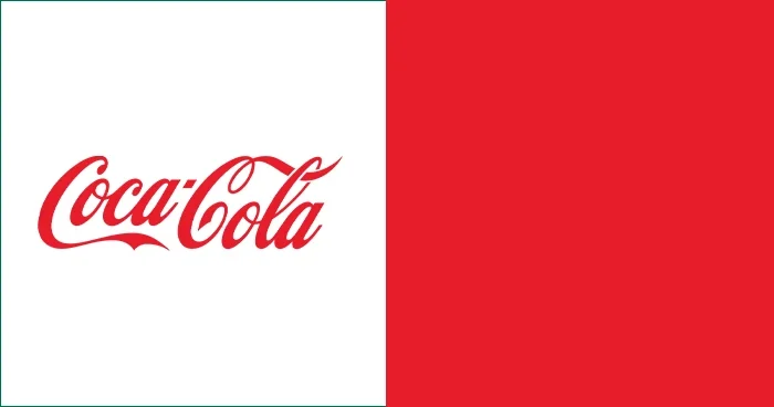
Coca-Cola uses red to create excitement, energy, and emotional intensity. The bold colour helps the brand feel youthful and instantly recognizable worldwide.
Facebook (Blue)

Facebook uses blue because it creates trust and reliability. Blue also feels less visually aggressive, making it comfortable for long browsing sessions.
Starbucks (Green)
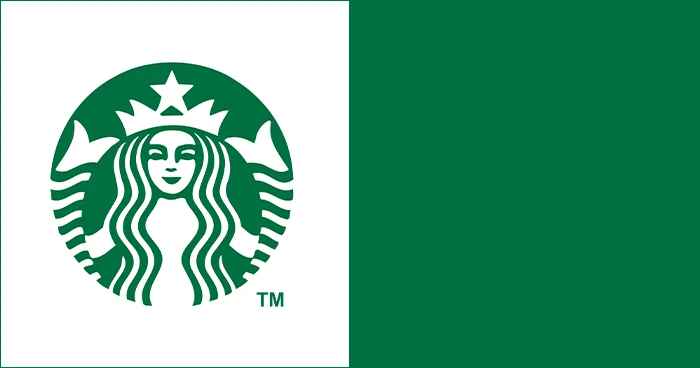
Starbucks uses green to reinforce ideas of freshness, relaxation, and sustainability. The colour supports the company’s identity around ethical sourcing and wellness.
Conclusion
The psychology of colour in marketing and branding is not just about aesthetics. Colours influence how customers feel, what they remember, and whether they trust a business.
The most effective brand colours are not always the brightest or trendiest. They are the colours that consistently communicate the right emotions to the right audience across websites, advertisements, and digital experiences.
When used strategically, colour psychology can strengthen brand recognition, improve customer perception, and support better marketing results over time.
FAQS
What Colour attracts customers the most?
Red is one of the most attention-grabbing colours because it creates urgency and excitement. However, the best colour depends on the audience, industry, and brand message.
How does Colour psychology affect buying decisions?
Colour psychology affects buying decisions by shaping emotional reactions and first impressions. Customers often judge whether a brand feels trustworthy, premium, or exciting based on visual appearance alone.
What is the best Colour for branding?
There is no single best Colour for branding. Blue works well for trust, green for wellness, and black for luxury branding. The right choice depends on your audience and business goals.
Why do fast-food brands use red and yellow?
Fast-food brands use red and yellow because these Colours attract attention quickly and create feelings of energy and excitement.
Which Colour builds the most trust in marketing?
Blue is widely considered the most trusted Colour in marketing because it creates feelings of reliability, professionalism, and security.